Funny how the littlest snippet of video can trigger a wave of childhood memories... Like this retro-electro PBS station identification, circa 1982...
Tuesday, July 25, 2006
Saturday, July 22, 2006
Canadian Pulp and Paper Pavilion
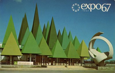 This is one of my favorite pavilions!
The architecture of the Canadian Pulp and Paper pavilion was that of a groovy, stylized forest. There were 44 treetops, the tallest of which reached the height of an 8-storey building. A sculpture on the outside of the pavilion symbolized an unwinding roll of paper.
This pavilion was dedicated to one of Canada's richest natural resources: forests and their derived products.
There were 4 major exhibits in this pavilion. The first section used whimsical sound effects and animation to describe forest legends across the world. The second section included 2 unusual theatres, with walls that suggested huge unwinding rolls of paper. The third section described the Pulp and Paper Industry's impact on the Canadian Economy.
The final section, Lab 67, was presented as a science whiz show. Lively demonstrations dealt with the chemical aspect of paper production, including it's unlimited future uses. Visitors could also see French Canadian artisans creating paper by hand.
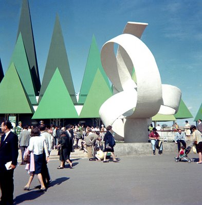
(bottom) FOS productions
Thursday, July 20, 2006
Madge the Manicurist
 I grew up watching soap operas with my mom as a kid. Real gems, too, like Search for Tomorrow and Another World...
I also grew up with Madge the Manicurist.
Madge appeared in Palmolive commercials during these daytime shows. Working at the "Salon East Beauty Parlor", she would secretly soak her customer's hands in the famous green dishwashing liquid, while telling them about Palmolive dish soap for at home.
The customer was usually shocked to find out that their hands were actually soaking in that very same dishwashing liquid for their manicure. "You're soaking in it!" Madge would reveal slyly, followed up by "Palmolive softens hands while you do dishes", to soothe her customer's qualms...
The customer was usually shocked to find out that their hands were actually soaking in that very same dishwashing liquid for their manicure. "You're soaking in it!" Madge would reveal slyly, followed up by "Palmolive softens hands while you do dishes", to soothe her customer's qualms...
Madge the Manicurist was created in 1966 by the Ted Bates Ad Agency, for the Colgate-Palmolive company. Jan Miner was the actress who portrayed Madge for almost 30 years, until 1992.
Jan Miner was constantly stopped in airports, Madge was known all across the world: in France her name was Françoise, the Germans called her Tilly, while the Finnish knew her as Marissa. International Palmolive commercials were never dubbed, Jan Miner actually read all the lines phonetically!
images: myspace.com and flickr.com
Video!
I'm very excited to be adding videos to my blog!
Check out the vintage TV dinner ad from 1970: "Just meat and potatoes... and good!"
I've also included the opening titles of the 1967 Avengers season, in glorious full color! This is possibly the coolest TV show theme, ever. Gotta love the way Emma Peel shoots off the champagne cork with a gun, only to later toss her hair aside with that same gun...
When appropriate, I'll be including videos in future posts...
 image: plan59.com
Check out the vintage TV dinner ad from 1970: "Just meat and potatoes... and good!"
I've also included the opening titles of the 1967 Avengers season, in glorious full color! This is possibly the coolest TV show theme, ever. Gotta love the way Emma Peel shoots off the champagne cork with a gun, only to later toss her hair aside with that same gun...
When appropriate, I'll be including videos in future posts...
 image: plan59.com
Wednesday, July 19, 2006
The Netherlands Pavilion
 The Netherlands pavilion's architecture contrasted strongly with the old-world charm associated with Holland. Located on Île Sainte-Hélène, the pavilion once stood where the Piknic Électronik is held today.
The roof and walls of the pavilion were suspended from an immense space frame that was made up of 35 miles of aluminum tubing and put together like a giant erector set. The result was a striking, futuristic structure, with a light, airy feel.
The pavilion's main focus was on the age-old battle between the Netherlands and the sea: it was the theme for three major exhibits.
The first exhibit was a huge model of the Zeeland Delta project, using 700 gallons of water to demonstrate the hydraulic complex that would provide the Netherlands with greater protection against the sea and increased fresh water supply. The second exhibit demonstrates the importance of the Rhine delta, using film to recreate the sensation of a ship sailing down the busy Rhine. The third exhibit featured a scale model of the Rotterdam, which was, in 1967, the world's busiest port.
Other displays covered topics such as the geography of the country, housing and urban planning (in one of the world's most densely populated areas), communications, culture and scientific achievements. There was a model of Amsterdam made of cork, and visitors could "call" the city's mayor (which was answered by a recorded message).
There was a section devoted to the arts, as well as a restaurant which served Dutch specialties.
 photos: (top) expo67.ncf.ca
Monday, July 17, 2006
Saturday, July 15, 2006
I Love Lucy
 I Love Lucy debuted on October 15, 1951.
A pioneer of the television situation comedy, I Love Lucy was the first to have a live studio audience.
From the beginning, millions were cast under the spell of the scheeming Lucy trying to forge her way into showbusiness. The chemistry between Lucy, her onscreen husband Ricky (played by real-life husband Desi Arnaz), and their best friends Fred and Ethel, is what made the show magic.
At first, CBS executives were worried that audiences wouldn't find Lucy's mixed marriage believable. They were also concerned about Desi Arnaz's heavy cuban accent. But Lucille Ball was adamant, and the executives finally agreed on the condition that Desi Arnaz or Ricky Ricardo's name not appear in the show's title. Desi Arnaz finally agreed to the title "I Love Lucy" the "I" being his inclusion.
Lucille Ball's mastery of physical comedy is key to the funniest scenes on the show: whether she was tipsy from an alcohol-based vitamin syrup or stuffing herself full of chocolate, the audience was left in stitches...
The show has been rerun ever since. For over 50 years it has been playing somewhere in the world.
I Love Lucy will forever remind me of my maternal grandmother who absolutely adores I Love Lucy...
image source unknown
Friday, July 14, 2006
The British Pavilion
 Britain's pavilion was a large, white, windowless one, featuring a 200-foot tower with a 3D Union Jack jutting out of the summit. The tower's design was purposely unfinished, to symbolize Britain's "unfinished business" in the world.
The pavilion's exhibit was split into several different sections:
Shaping Britain dealt with Britain's earliest history, through a presentation of film and light effects.

The Genius of Britain used a 3 dimensional mural to display great figures of Britain's past.
Britain Today was a series of tableaux which depicted modern Britain of 1967.
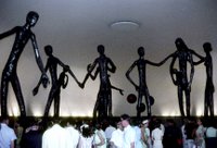
Britain's technological achievements were highlighted in the section Industrial Britain.
Britain in the World was a message of peace, depicted by giant metal sculptures which expressed goodwill and fellowship of man.
I love the Britain Today section, it was totally cool! Being a window dresser, I dig the displays that were set up like store windows, using mannequins and props to convey the feeling of Britain in the 60's...
 Britain was most certainly at it's high during the 1960's, with innovators like the Beatles, Mary Quant and Vidal Sassoon shaping pop culture and influencing the world...
photos: (top) naid.sppsr.ucla.edu/expo67/
(middle) FOS productions
(bottom) expo67.ncf.ca
Saturday, July 8, 2006
Expo Architecture: Theme Pavilions
The architects of the Man the Explorer and Man the Producer theme pavilions were faced with a problem: how to quickly and inexpensively put up large buildings, with polyvalent spaces adaptable to either small exhibits or enormous displays?
The architects decided to use the truncated tetrahedron shape as a sort of building block, to obtain the spaces needed for exhibits that didn't exist yet. The truncated tetrahedron is like a triangle with the corners cut off. Thousands of steel units in this shape would be stacked and joined together, creating the massive trelliswork required for these pavilions.
The initial idea was a good one, the designs and models of these buildings were elegant. Then, another problem arose: there weren't enough steel welders in Canada to weld the units together! Instead, they were bolted, which required heavy bracing to be solid. The result was an oppressive metal structure, which quickly rusted.
I have a love/hate relationship with these pavilions. I do find them rather ugly, but totally cool at the same time...
photos: (1) westland.net/expo67
(2) courtesy DC Hillier
(3) alamedainfo.com
(4) unknown source
(5) personal collection
(6) library and archives Canada
Friday, July 7, 2006
Spiderman '67
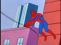 One of my favorite cartoons as a kid was the classic Spiderman.
It used to rerun around lunch time on CJOH. I ate many a TV dinner watching Spiderman save the world in true Spidey style!
This Saturday morning cartoon was created in 1967, lasting three seasons, until 1970. The first season stayed true to the actual comic book, with stories that focussed a lot on Peter Parker's day job/superhero juggle. J. Jonah Jameson was fun to hate, and how could you (or Peter Parker) resist the redheaded beauty of the Daily Bugle's secretary, Betty Brant?
Budget cutting and a new producer brought changes to the second and third seasons: this was the era of extensive repeating of Spiderman's swinging scenes. During t
 his time, the storylines became zanier, and the hand-painted backdrops became truly psychedelic.
Add to that the cheesy music, and you have a show with a particular mood that has never been rivaled...
As a kid, I didn't care if the animation repeated itself... I loved this show!
To see the 6-dvd boxed set (on Amazon.com), click here.
images: dvdork.com
Wednesday, July 5, 2006
Expo 67 Ads
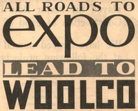 In the 10 years I've been collecting Expo 67 paraphernalia, I've amassed quite a large collection.
A few years ago, I acquired the Expo opening day editions of the Montreal Gazette and the now-defunct Montreal Star.
Each of these newspapers had published "special Expo editions" on April 27, 1967. The information and photos are amazing, the enthusiasm of the day was unmistakeable.

The best part of these documents are the ads. Expo 67 was a world class event that was to generate millions of tourist dollars. Every business in Montreal wanted to jump on the bandwagon, and they almost all did. Everything from camera shops to pet stores... There's even an ad for a strip club!
I've scanned a collection of these ads and uploaded them on Flickr.com. I also included the comics of the day, which all mention Expo. And, lastly, the Gazette's special Expo crossword puzzle (with solution, of course...).
Click here to view the whole set.

Tuesday, July 4, 2006
Hey Friend Say Friend
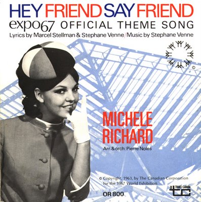 After years of searching, I have finally found the original cover art to the 45 single of the Expo 67 theme song, as done by Michèle Richard. Michèle is dressed in the official Expo hostess uniform.
Needless to say, it is very rare and ultra hard to find!
Side A is the original french version Un jour un jour while side B features the English version.
It is the ultimate piece in my collection, the one that bridges the gap between my two biggest passions: Expo 67 and Michèle Richard!
image: personal collection
Monday, July 3, 2006
Le Château
 Le Château is a true Montreal institution.
The company was founded in 1959, by Mr. Herschel Segal. A pair of bell-bottoms bought on a trip to London, England inspired him. What if he could translate the Carnaby Street look to hip Montrealers looking for high fashion, without the hefty price tag?
The Le Château legacy was born.
The original store was a tiny location on Saint Catherine Street, that began with menswear only. The name "Le Chateau" was a bit tongue-in-cheek, given it's diminutive size. A ladies' collection was added in 1962.

The 1960's saw Le Château build itself a solid reputation by offering the latest groundbreaking styles to it's customers, including a succesful leather-goods line. Among some famous Le Château customers of that period, we can count the Beatles, who visited the store while in Canada, and famous artist Erte, who had costumes made for... you guessed it... Expo 67!
Montreal artist Vittorio Fiorucci (who is best known for the Just for Laughs cartoon mascot) is credited for having created Le Château's two circle and triangle logo in the early 70's. The design was revamped in the 1980's, to the trademark that we know today, which still appears on Le Château shopping bags.
Like any company, Le Château has had it's ups and downs over the years, but it remains today one of Canada's leading retailers.
 images: special thanks to Cara Braude from Le Château's head office
Sunday, July 2, 2006
The Pavilion of Iran

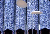 The Iranian participation at Expo 67 consisted of an exotic pavilion located on Île Sainte-Hélène.
The architectual style of the pavilion was inspired by ancient Iran, with beautiful tile columns serving as an example of Iranian decorative art.
Inside, the pavilion's colors and lighting sought to create an atmosphere that represented the spirit of Iran. Rich persian carpets formed a constant backdrop throughout the pavilion.
A section devoted to "Tradition" displayed archaeological treasures such as 3000-year old golden vases, 12th and 13th century bronzes, and hand painted ceramics.
In another section of the pavilion, the ancient Persian empire could be discovered through sumptuous displays of gold and silver objects, dishes, mirrors, chandeliers and jewels.
An extensive exhibit of photographs in the central hall of the pavilion showed the progress that Iran had made in such fields as health care, education, the (gradual) emancipation of women, and electoral reform.
Iranian craftsmen could be observed, working at looms creating the world-renowned Persian carpets. Iranian vodka, caviar and other specialties could be sampled on the patio's bar.
(5) DC Hillier
(6) Bill Dutfield
Subscribe to:
Comments (Atom)