Showing posts with label pop culture parade. Show all posts

Friday, May 4, 2012

Mike Wallace

Mike Wallace
"I'm Mike Wallace, and this is 60 Minutes..."

Mike Wallace was born Myron Leon Wallace on May 9, 1918, in Brookline Massachussets.

Wallace began his acting and announcing career in 1939, after studying broadcasting at the University of Michigan.  Throughout the 1940's, he performed in various different radio show genres – quiz shows, talk shows, commercials, serials, and news reading.  It was in 1951, at age 33, that Mike Wallace moved to New York City and began what would become a 6-decade television career.

Mike Wallace
Mike Wallace and Buff Cobb on the set of "Mike & Buff", 1951.

Mike Wallace's first foray into interviewing was during the husband-and-wife talk show "Mike and Buff", which aired weekday afternoons on CBS. Co-hosted with then-wife Buff Cobb, Wallace conducted live interviews with celebrities and passers-by in various New York locations. The talk show (and their marriage) ended in 1954.

Other early television work included announcing and game show hosting for programs such as "What's in a Word?", as well as acting in shows such as the "Stand by for Crime" police drama and the "Studio One" anthology series.  In 1954, Wallace even had a brief stint on Broadway, acting in the play "Reclining Figure", directed by Abe Burrows.

During this time, Mike Wallace also did television commercials for a variety of products, including Procter & Gamble's "Golden Fluffo" brand shortening, and Philip Morris cigarettes...

Mike Wallace
Promotional shots for "The Mike Wallace Interview", 1957.

In 1956, the vehicle that brought Mike Wallace's unique interviewing style to prominence was created. "Night Beat" was a live, late night hour talk show where Wallace grilled celebrity guests on controversial topics, developing a hard edge that was lacking in television at the time. Armed with solid research and provocative questions, Wallace made guests squirm.  Using only a black backdrop and harsh lighting (with cigarette smoke for atmosphere), the interviews were framed in tight close-ups, revealing the sweat elicited by Wallace's grilling.

Only airing locally, "Night Beat" later developed into the nationally televised prime-time program "The Mike Wallace Interview" which ran until 1960.


60 Minutes

Mike Wallace
"Tick, tick, tick, tick, tick..."

"The Mike Wallace Interview" may have made him a star, but "60 Minutes" is what made Mike Wallace a legend.

On September 24, 1968, "60 Minutes" debuted on CBS.  Initially, the show was aired bi-weekly on Tuesday evenings at 10pm, with Mike Wallace and Harry Reasoner as the show's only 2 hosts. The contrast was intentional: Wallace as the abrasive, crusading detective-type opposite Reasoner's mild-mannered, analytical persona.

"60 Minutes" quickly became known for its in-depth investigations and hard-hitting exposés, thanks in part to Mike Wallace's tough journalistic style. As the show progressed, he perfected his trademark "ambush" interview technique: after secretly filming scam artists and wrong-doers in action, Wallace confronted them without warning in parking lots, hallways, wherever a comment (or a stricken expression) might be harvested.

Mike Wallace's ability to uncover corruption, greed and deceit generally garnered him praise – and numerous awards – but some critics deemed his methods unfair, underhanded and too sensational.

Ambushes aside, Mike Wallace was also known for his high-profile interviews, sitting down with some of the most iconic figures of the 20th century.  A brilliant interviewer, Wallace always did his homework, delivering his questions with a smooth combination of toughness and grace...

Mike Wallace
Mike Wallace and Harry Reasoner in 1968.

Growing up, Sunday nights were marked in our house by "60 Minutes".  The handsome, baritone-voiced Mike Wallace was always my favorite, especially when he nabbed the "bad guys" in those iconic ambush interviews...!

Even though the subject matter was often too 'adult' for me to follow (and I never understood Andy Rooney), the tick-ticking of the "60 Minutes" stopwatch has always been, to me, as comforting as a glass of warm milk...

Below is an excerpt of the first ever "60 Minutes" from 1968, where Harry Reasoner introduces it as a "kind of a magazine for television"...


images: (1) cbsnews.com
(2) mtv.com
(3) wikipedia
(4) entertainment.time.com
(5) unknown source

Friday, February 18, 2011

Kitchen Colors of the 50's, 60's and 70's

Kitchen Colors of the 50's, 60's and 70's
Fashion is a reflection of its time, the mirror of society.  Color has always played a pivotal role in fashion, and color trends can speak volumes about an era's social attitudes.

Kitchens are arguably one of the most important rooms of a home, the veritable nerve center of a household. The evolution of kitchen colors from the 1950's to the 70's is a fascinating one.

The 1950's: Pastel Pretty

Kitchen Colors of the 50's, 60's and 70's
The post-war 1950's were a time of optimism and prosperity.  While women got a taste of working outside the home during World War II, they went back to their kitchens in the 1950's. Homes were modern and new; it was the birth of suburbia.

Pink was a predominant color in the 1950's.  While red is the color of passion and raw emotion, mixed with white it becomes pink, the color of nurturing.  Soft pinks ushered women back into the home, encouraging them to nurture their husbands and families.

Another important shade of the era was turquoise, a spiritual, healing color.  Turquoise in the 1950's kitchen was meant to encourage positive family relationships.

Yellow represents ego and intellect, and the light, buttery yellow associated with the period represented a need to evolve one's sense of self.

Kitchen Colors of the 50's, 60's and 70's

Kitchen Colors of the 50's, 60's and 70's

Kitchen Colors of the 50's, 60's and 70's

The 1960's: Transition and Change

Kitchen Colors of the 50's, 60's and 70's
The prim-and-proper 1950's gave way to the far-out 1960's.

Contrary to her 50's counterpart, the 60's woman was getting out of the kitchen. 

Color exploded, echoing the anxiety and rebellion associated with the 1960's. A decade of change, the colors that emerged reflected the issues that concerned not only women, but society in general. Complimentary colors were thrown together in wild combinations.  The mainstreaming of drug culture and psychedelia resulted in bright patterns finding their way on curtains, tablecloths and wallpaper.

Red was at the forefront of these tumultuous times, representing emotional upheavel and rebellion.  A passionate color, 60's red was agitated and restless... it called to action!

Lime green is created by mixing green with yellow, and bright, lime greens were popular in the 60's.  Green is the color of relationships, especially those related to the heart.  Often used with yellow (the color of ego and intellect), the combination represented a renewed sense of self. 

Orange was an important hue, representing transition and change. Pink still had a nurturing quality, but brighter shades containing red undertones represented excess. Graphic black and white were used to intensify the colors around them.

Interesting to note, blue was significantly missing in the 1960's color palette. Blue is calming, it represents honesty, communication and relationships.  Were the times were too turbulent to appreciate blue...?

Kitchen Colors of the 50's, 60's and 70's

Kitchen Colors of the 50's, 60's and 70's

Kitchen Colors of the 50's, 60's and 70's

Kitchen Colors of the 50's, 60's and 70's

The 1970's: Harvest Gold and Beyond

Kitchen Colors of the 50's, 60's and 70's
After the turmoil of the 1960's, the 70's were all about harmony.

The Vietnam War ended, peace was restored to university campuses and women began to feel that they could make a difference in the world.

As things began to settle, the chaotic colors of the previous decade gave way to muted tones.  Earth tones, particularly browns, offered a calm, grounding energy.  Contrary to the 1960's, colors were now working with each other, not against.

Avocado Green was an important color in the 70's.  Green is the color of harmony and relationships with self and/or others. Green helps establish foundations.  While the lime greens of the 60's were tinted with yellow (the color of ego), 70's Avocado Green was tinted with black (the color of humility).  Symbolically, the “ego” of the sixties was replaced by the humility of the 70's...

Another important hue of the decade was Harvest Gold.  A muted shade of yellow, it offered the same rich, grounding energy as the earth tones did.  Orange remained extremely popular, but the acidic hue of the 60's toned itself down for the 70's.  Wood and wood grains completed the look...

Fondue, anyone?

Kitchen Colors of the 50's, 60's and 70's

Kitchen Colors of the 50's, 60's and 70's

Kitchen Colors of the 50's, 60's and 70's

Match Your Mood!

Kitchen Colors of the 50's, 60's and 70's

Kitchen Colors of the 50's, 60's and 70's
For a time in the 1960's, refrigerators were being advertised as exciting machines that could fit effortlessly into modern lifestyles.  From French Provincial to Country... or a futuristic fridge for outer space!

The video below is a promotional film from 1968 for the Westinghouse Continental fridge, featuring a variety of fabulous and exotic door panels: Supreme WalnutRattan, Astro-Glo-Bronze, Surftex Black, etc.  And for the really adventurous, a system of do-it-yourself panels to Match Your Mood...


images: (1-5) plan59.com
(2-3-4-6-7-14) flickr.com
(8) curly-wurly.blogspot.com
(9-10-12) thekitchendesigner.org
(11-13) desiretoinspire.net
(15) kitschyliving.tumblr.com

Sunday, May 17, 2009

Disneyland's House of the Future

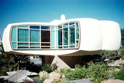
The House of the Future was an attraction that debuted in 1957 at the Disneyland theme park in Anaheim, California. Sponsored by the Monsanto Chemical Company, the ultra-modern house was almost entirely synthetic.

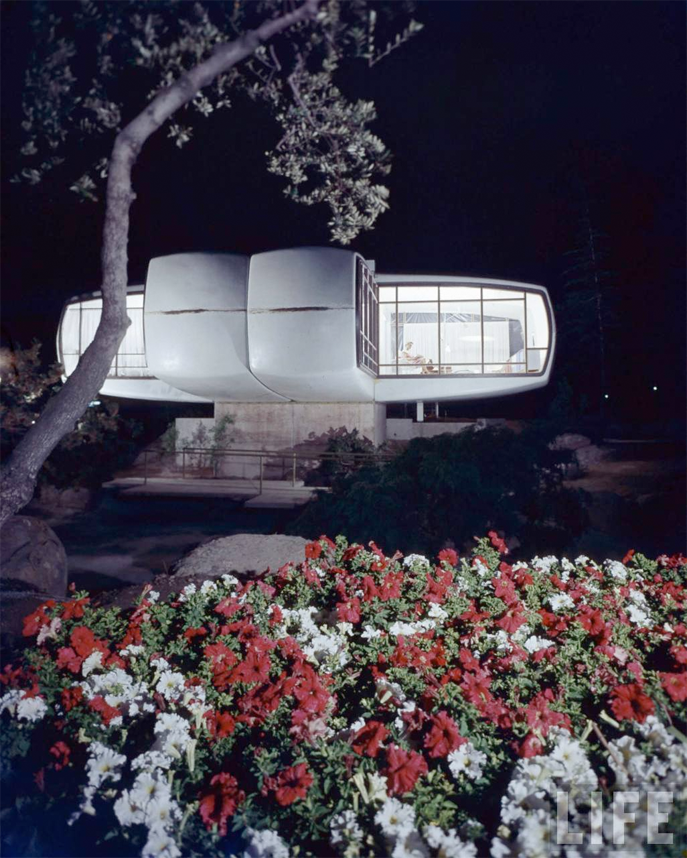
Set in the year 1986, the House of the Future's 4 equal wings seemed to float above its beautifully landscaped grounds and waterfalls.

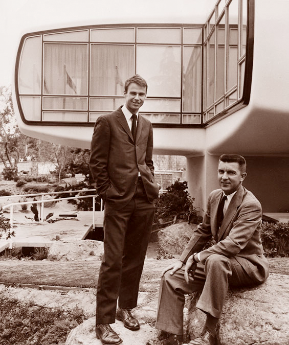
The house's designers, Marvin Goody and Richard Hamilton.

Designed by Marvin Goody and Richard Hamilton of the Goody Clancy firm in Boston, Massachusetts, the 1280 square foot structure took 2 years to develop. Originally members of the faculty or architecture at the Massachusetts Institute of Technology, Goody and Hamilton were hired by Monsanto to find new markets for plastic products. They eventually formed their own private firm to take over the commercial planning of the project.

A 1966 magazine article describing Monsanto's futuristic plastic house.

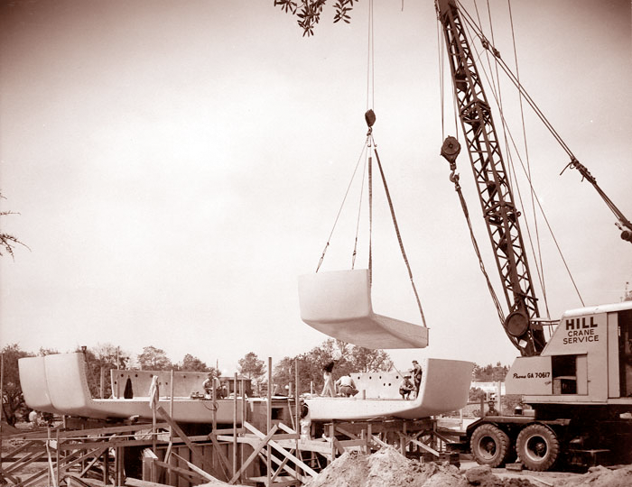
The House of the Future was made from 8 prefabricated plastic modules, placed one on top of the other, forming the ceiling, floor, and wall (the remaining walls were windows). When the modules originally arrived at Disneyland for assembly, receiving clerks thought they were part of a boat!

The central core of the house contained the kitchen and bathrooms, while the four wings each contained one room. The entire structure was solidly anchored to an earthquake rated concrete foundation.

The House of the Future under construction, in early 1957.

Construction at Disneyland began on January 7, 1957, and was completed by early June. A special preview day was held on June 11, 1957, while the official public opening of the House of the Future was held the next day.

An estimated 60,000 visitors toured the House of the Future each week.

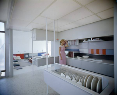
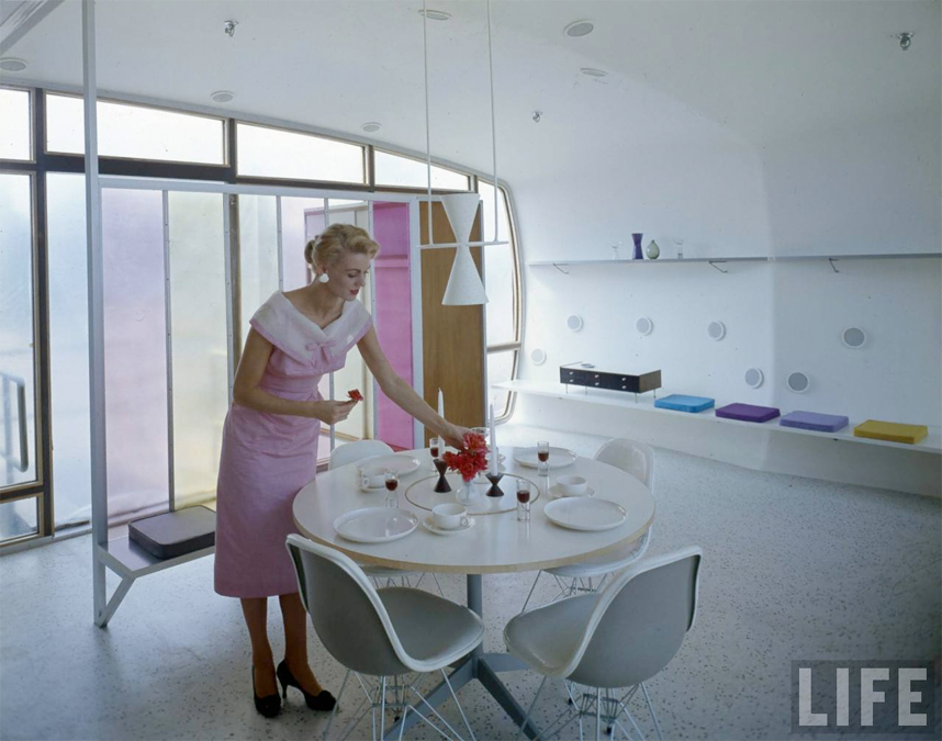
Upon entering, visitors found themselves in the dining and family room, a place where the family of the future would play, rest, and dine on stylish plastic furniture. Nearby, the Atoms for Living Kitchen awed guests with futuristic amenities such as the microwave oven.

The 2 children’s bedrooms followed, one for the boy of the future and one for the girl of the future, as well as the shared kids’ bathroom. The master bedroom and the main bathroom were next on the tour, which concluded itself in the sleek living room, featuring a giant, wall-mounted television and built-in high fidelity equipment.

The futuristic kitchen featured an ultra-sonic dishwasher.

The dining room of the future... with plastic dishes, of course!

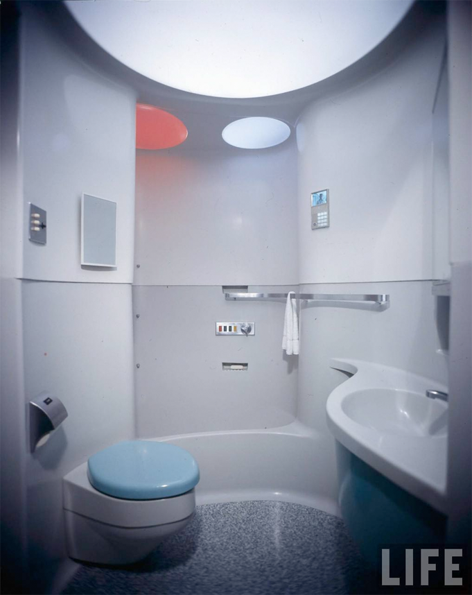
The ultra-modern bathrooms were completely molded in plastic.

A night view of the House of the Future.

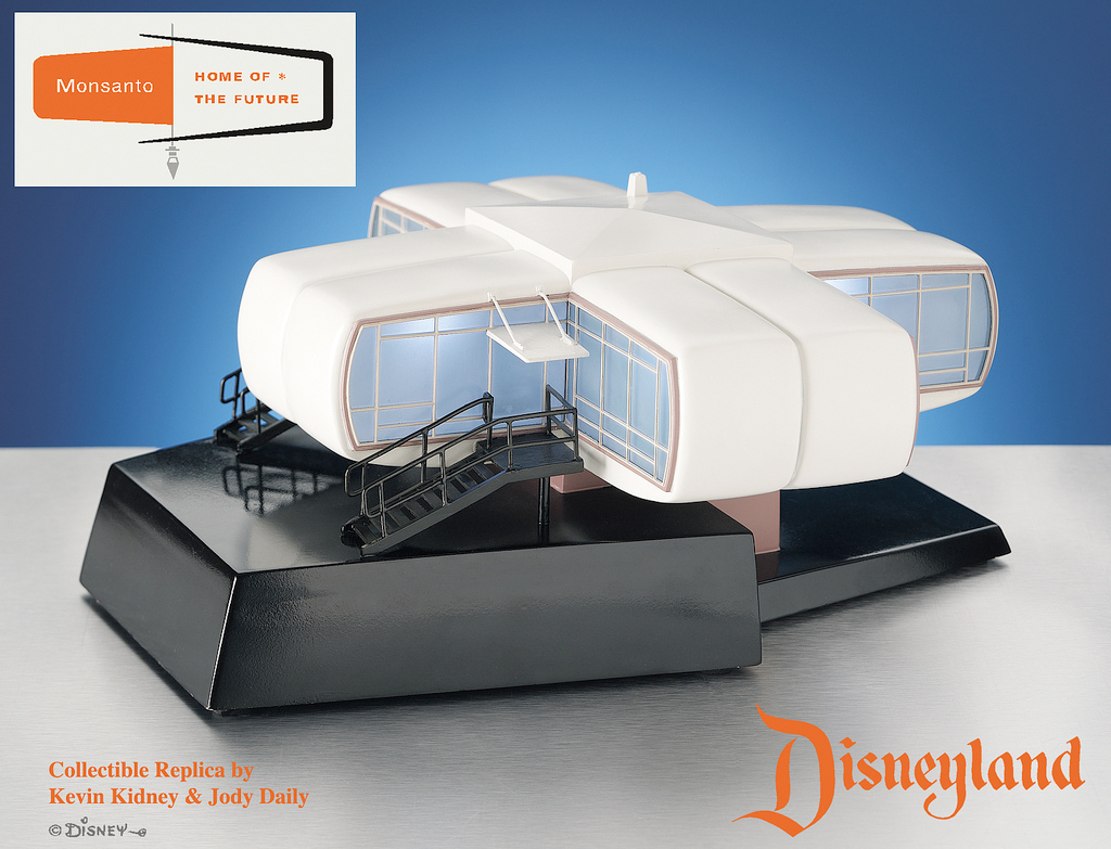
An illuminated replica, in a limited edition of 1000, produced in 1996.

The House of the Future is yet another example of the retro-futuristic aesthetic that I adore, reminding me a bit of Jacque Fresco's designs...

Vanished today, there continues to be subtle tributes to the House of the Future both at Disneyland and Walt Disney World...


images: (1) yesterland.com
(2, 4 & 11) flickr.com
(3, 5 & 6) davelandweb.com
(7, 8, 9, 10 & 12) LIFE photo archive

Thursday, August 28, 2008

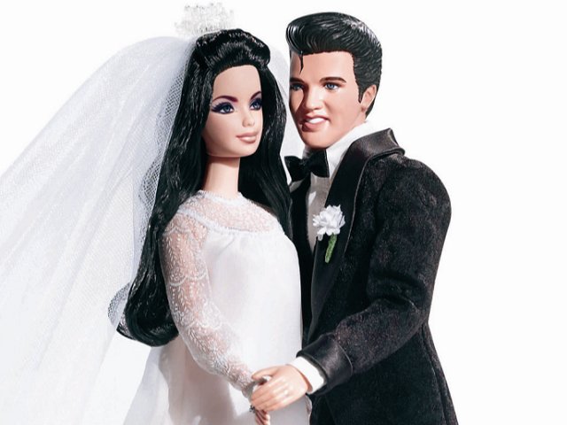
Elvis and Priscilla Barbie Dolls

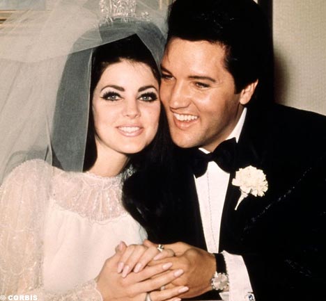
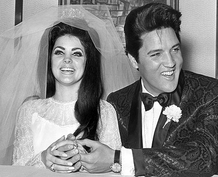
Elvis Presley married Priscilla Beaulieu on May 1, 1967.

The private ceremony was held in one of the most grandiose suites at the Aladdin Hotel, in Las Vegas. The bride wore a beaded white gown, with a tiara mounted on her (fab) dyed black beehive. Elvis wore a black brocade suit. Priscilla's sister Michelle was her maid of honor, while Memphis Mafia members Marty Lacker and Joe Esposito acted as Elvis' best men.

Upon Elvis' request, the word "obey" was removed from the wedding vows. Despite the couple's notoriety, the ceremony took all of 8 minutes to conclude!

Unfortunately, the marriage didn't last long. The couple were seperated in 1972 and officially divorced in 1973.

Mattel (the makers of the Barbie doll) have just released a Graceland-approved box set to commemorate Elvis and Priscilla's wedding. Earlier this month, select fans gathered for the dolls' unveiling at Elvis' defunct home (now a museum) in Memphis, Tennessee.

These die-hard fans were treated to slices of wedding cake and orange juice served in champagne glasses.

images: (1-2) source unknown
(3) virginmedia.com
(4) source unknown

Monday, February 25, 2008

Noxzema Skin Cream

A Noxzema jar from the 1940's.

Noxzema skin cream was invented in 1914 by a Baltimore pharmacist named Dr. Bunting. Originally called "Dr. Bunting's Sunburn Remedy", the earliest concoction was a combination of medication and vanishing cream sold as a treatment for sunburn. For the first 3 years, Bunting did all the mixing, heating, and pouring of the product himself.

Legend has it that the name Noxzema came from a satisfied customer who exclaimed, "You knocked my eczema!"

An ad from the 1940's stated that Noxzema was "wonderful for chapped hands, too."

The first Noxzema factory opened in 1920, in Baltimore, with the slogan “the miracle cream of Baltimore”. Demand grew steadily as the years progressed and by the 1940's, Noxzema had achieved national popularity through radio and print ads... There was even a Noxzema blimp!

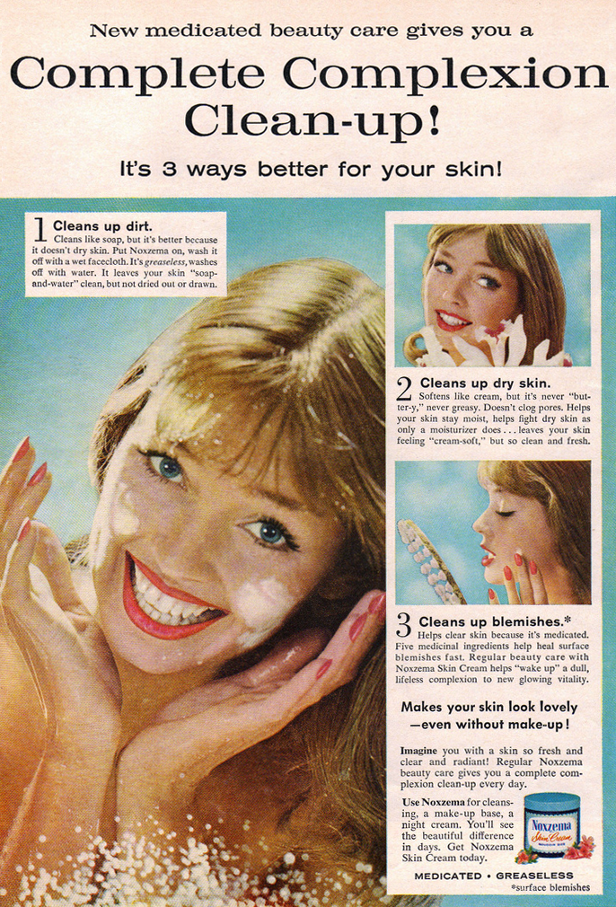
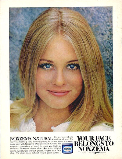
This ad from the 60's suggested using Noxzema under makeup or at night.

In the 1950s, the Noxzema product line expanded to include other personal care products such as shave cream, suntan lotion and cold cream. In 1960, the Cover Girl line of cosmetics was launched, backed by an advertising campaign that used actual magazine cover girls enthused by this "glamorous new makeup". Cover Girl cosmetics touted the inclusion of Noxzema's medicated ingredients in its formulas.

The Noxzema company changed its name to Noxell in 1966. In 1989, Noxell was acquired by Procter & Gamble. Noxell had remained in the hands of the Bunting family until this merger.

A Noxzema ad from the 1970's, featuring a young Cybill Shepherd.

Noxzema owes its distinctive fragrance to the inclusion of camphor, menthol, and eucalyptus in its formula. Together with the ubiquitous blue jar, they have been Noxzema's hallmarks since 1914.
An early 70's commercial for Noxzema shaving cream, with Farrah Fawcett.

images: all flickr.com

Tuesday, April 3, 2007

Retro Wallpaper

I've always loved wallpaper!

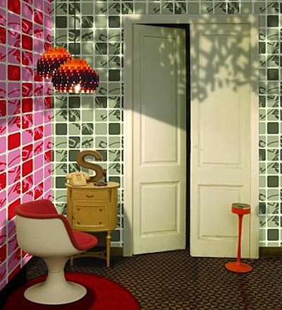
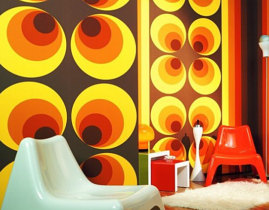
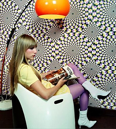
Wallpaper was very popular in the 50's, 60's and 70's, but seemed to fall out of favor after that. The fashion pendulum is now swinging back, making wallpaper once again the must-have element to any stylish decor.

A new generation of young, dynamic designs is emerging. And fashion's fascination with all things retro means only one thing: retro wallpaper!

Check out wallpaperfromthe70s.com for some groovy eye candy...

images: wallpaperfromthe70s.com

Friday, February 16, 2007

Plan59.com

I love 1950's ads.

Anyone that loves the 50's as much as I do should visit Plan59.com.

There are hundreds of images, many of which can be purchased as prints.

There's an extensive gallery of automobile images that makes me drool!

Oh, how I'd love to ride around in a mint green '58 Chevy!

images: plan59.com

Saturday, February 3, 2007

CorningWare

CorningWare was introduced in 1958. It was made of a glass ceramic material that could be used in the oven or on the stovetop.

As with many inventions, CorningWare was a lab mistake. A malfunctioning furnace heated to 900° instead of 600°, and amazingly, the glass inside did not melt. A chemist later dropped the white glass, and surprisingly, it didn't break. These accidents lead to the creation of Pyroceram and the very first pieces of CorningWare in 1957.

Though long out of production, the Blue Cornflower pattern remains synonymous with CorningWare for most (including me). It seems like everyone's mother had CorningWare pieces with this dainty blue pattern.

As a child, I remember playing with miniature CorningWare toys made to mimic our mothers' bakeware and coffee/tea pots.

These pieces will always hold a special place in my heart.

I think I'll start a collection...

images (top) amazon.com
bottom: flickr.com

Saturday, November 25, 2006

Walt Disney's EPCOT Project

In the early 1960's, entertainment mogul Walt Disney was blessed with a loving family that included many grandchildren. Walt became concerned with the world in which these kids would grow up: modern cities were chaotic, dirty and crime ridden.

With the success of the Disneyland theme park in Anaheim, California, Walt began to dream of a far more ambitious project. What if the concepts of space and building design used in the Disneyland theme park could be used in the planning of communities, even entire cities? Walt began to devour books pertaining to urban planning, and anything else that could be usefull towards what he would later call his "prototype of the future"...
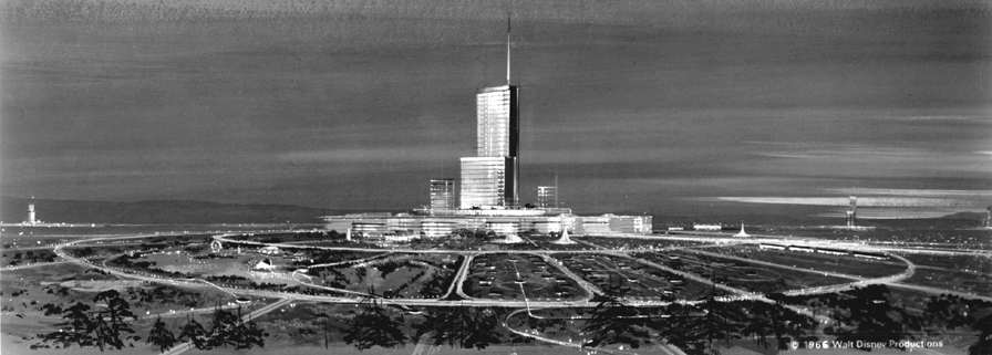
The Walt Disney company had purchased 27 400 acres of swampland near Orlando, Florida. Walt intended to use this land for his project, which was now being called the Experimental Prototype Community Of Tomorrow, or EPCOT for short.

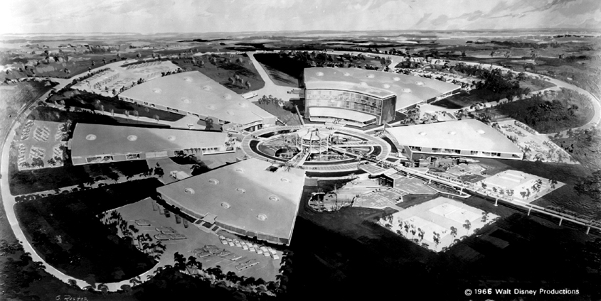
The original EPCOT plans used the radial (pie shaped) concept. It was to have 20 000 permanent residents, a Jet Airport of the Future, schools, stores, offices and theatres. EPCOT was to be completely enclosed, sheltered from the outside elements.
Cars and trucks would use underground passageways, while visitors and residents would rely on a monorail system to get around.An important element to Walt Disney's original plan was EPCOT's Industrial Park. Major American industries would use this facility to develop new technologies for use in the EPCOT city. Walt's idea was that visitors from across the world would be inspired by these new developments and want to implement them in their own countries.The following video is a 24-minute pitch reel from 1966, in which Walt describes the EPCOT project:

images: waltopia.com