Friday, February 25, 2011

"Expo 67": What's in a Name?

"Expo 67": What's in a Name?
Nowadays, it's commonplace for a world exhibition to call itself "Expo". Interestingly,  the appellation actually originated at Montreal's Expo 67.

In an email correspondence, Yves Jasmin recalls how the name came to be:

'The official name was "The 1967 Universal and International Exhibition in Montréal / L'Exposition universelle et internationale de 1967 à Montreal". A bit of a mouthful. It needed a more convenient name.'

"World's Fair" would have been the obvious choice, but the organizers of Montreal's exhibition did not want to call it a "fair".  Yves explains:

'The New York World’s Fair (1964-65) was in full swing and fairs have a commercial overtone while the Montreal event was thematic and NOT a fair.'

He goes on to credit Montreal Mayor Jean Drapeau for the idea of "Expo 67":

'Mayor Drapeau suggested the name "Expo 67", recalling a 1937 Maurice Chevalier song "La p'tite dame de l'Expo", a girlfriend he had met at the spectacular 1937 "specialized" exhibition [Les Arts et Métiers] in Paris.  Drapeau's suggestion carried unanimity.'

Yves stresses that "Expo 67" had a chilly reception from the English press:

'I waged a three-year battle with the Gazette and the Montreal Star who fought hard to get Expo to change its name to 'Montreal World's Fair'.  For two of those years we were in direct conflict with the New York World's Fair, still the Montreal English speaking journalists fought "Expo" tooth and nail, saying that "Expo'' sounded like a new brand of cigarette, that "Expo" did not convey the significance of an exhibition, etc.'

The legacy of the word "Expo" would be assured in 1970, as Yves explains:

'When Japan had its 1970 World Exhibition, they asked our permission to call it "Expo 70". It was a very gracious move on their part. We didn't even have the creative rights of the name. And now Expo has become a household word all over the world'...

"Expo 67": What's in a Name?
UPDATE (02-27): Some readers have commented that the Brussels exhibition in 1958 had also called itself "Expo".  Perhaps I was getting ahead of myself when stating that the term was "invented" for 1967.  "Expo" as a diminutive of "exposition" in French was nothing new by 1967, but the universal acceptance of the word in the English language remains attributable to Expo 67. 

Yves Jasmin quotes culled from John Whelan's Expo 67 website.

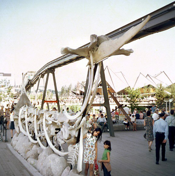
images: (top) alamedainfo.com
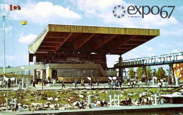
(bottom) library and archives Canada

Friday, February 18, 2011

Kitchen Colors of the 50's, 60's and 70's

Kitchen Colors of the 50's, 60's and 70's
Fashion is a reflection of its time, the mirror of society.  Color has always played a pivotal role in fashion, and color trends can speak volumes about an era's social attitudes.

Kitchens are arguably one of the most important rooms of a home, the veritable nerve center of a household. The evolution of kitchen colors from the 1950's to the 70's is a fascinating one.

The 1950's: Pastel Pretty

Kitchen Colors of the 50's, 60's and 70's
The post-war 1950's were a time of optimism and prosperity.  While women got a taste of working outside the home during World War II, they went back to their kitchens in the 1950's. Homes were modern and new; it was the birth of suburbia.

Pink was a predominant color in the 1950's.  While red is the color of passion and raw emotion, mixed with white it becomes pink, the color of nurturing.  Soft pinks ushered women back into the home, encouraging them to nurture their husbands and families.

Another important shade of the era was turquoise, a spiritual, healing color.  Turquoise in the 1950's kitchen was meant to encourage positive family relationships.

Yellow represents ego and intellect, and the light, buttery yellow associated with the period represented a need to evolve one's sense of self.

Kitchen Colors of the 50's, 60's and 70's

Kitchen Colors of the 50's, 60's and 70's

Kitchen Colors of the 50's, 60's and 70's

The 1960's: Transition and Change

Kitchen Colors of the 50's, 60's and 70's
The prim-and-proper 1950's gave way to the far-out 1960's.

Contrary to her 50's counterpart, the 60's woman was getting out of the kitchen. 

Color exploded, echoing the anxiety and rebellion associated with the 1960's. A decade of change, the colors that emerged reflected the issues that concerned not only women, but society in general. Complimentary colors were thrown together in wild combinations.  The mainstreaming of drug culture and psychedelia resulted in bright patterns finding their way on curtains, tablecloths and wallpaper.

Red was at the forefront of these tumultuous times, representing emotional upheavel and rebellion.  A passionate color, 60's red was agitated and restless... it called to action!

Lime green is created by mixing green with yellow, and bright, lime greens were popular in the 60's.  Green is the color of relationships, especially those related to the heart.  Often used with yellow (the color of ego and intellect), the combination represented a renewed sense of self. 

Orange was an important hue, representing transition and change. Pink still had a nurturing quality, but brighter shades containing red undertones represented excess. Graphic black and white were used to intensify the colors around them.

Interesting to note, blue was significantly missing in the 1960's color palette. Blue is calming, it represents honesty, communication and relationships.  Were the times were too turbulent to appreciate blue...?

Kitchen Colors of the 50's, 60's and 70's

Kitchen Colors of the 50's, 60's and 70's

Kitchen Colors of the 50's, 60's and 70's

Kitchen Colors of the 50's, 60's and 70's

The 1970's: Harvest Gold and Beyond

Kitchen Colors of the 50's, 60's and 70's
After the turmoil of the 1960's, the 70's were all about harmony.

The Vietnam War ended, peace was restored to university campuses and women began to feel that they could make a difference in the world.

As things began to settle, the chaotic colors of the previous decade gave way to muted tones.  Earth tones, particularly browns, offered a calm, grounding energy.  Contrary to the 1960's, colors were now working with each other, not against.

Avocado Green was an important color in the 70's.  Green is the color of harmony and relationships with self and/or others. Green helps establish foundations.  While the lime greens of the 60's were tinted with yellow (the color of ego), 70's Avocado Green was tinted with black (the color of humility).  Symbolically, the “ego” of the sixties was replaced by the humility of the 70's...

Another important hue of the decade was Harvest Gold.  A muted shade of yellow, it offered the same rich, grounding energy as the earth tones did.  Orange remained extremely popular, but the acidic hue of the 60's toned itself down for the 70's.  Wood and wood grains completed the look...

Fondue, anyone?

Kitchen Colors of the 50's, 60's and 70's

Kitchen Colors of the 50's, 60's and 70's

Kitchen Colors of the 50's, 60's and 70's

Match Your Mood!

Kitchen Colors of the 50's, 60's and 70's

Kitchen Colors of the 50's, 60's and 70's
For a time in the 1960's, refrigerators were being advertised as exciting machines that could fit effortlessly into modern lifestyles.  From French Provincial to Country... or a futuristic fridge for outer space!

The video below is a promotional film from 1968 for the Westinghouse Continental fridge, featuring a variety of fabulous and exotic door panels: Supreme WalnutRattan, Astro-Glo-Bronze, Surftex Black, etc.  And for the really adventurous, a system of do-it-yourself panels to Match Your Mood...


images: (1-5) plan59.com
(2-3-4-6-7-14) flickr.com
(8) curly-wurly.blogspot.com
(9-10-12) thekitchendesigner.org
(11-13) desiretoinspire.net
(15) kitschyliving.tumblr.com

Saturday, February 12, 2011

The Atlantic Provinces Pavilion

The Atlantic Provinces Pavilion (Expo 67)
The Atlantic provinces pavilion at Expo 67 represented the provinces of Nova Scotia, New Brunswick, Prince Edward Island and Newfoundland.

The Atlantic Provinces Pavilion (Expo 67)
Located on Île-Notre-Dame near the Indians of Canada, the pavilion was a mostly open structure with a wooden, cantilevered roof (claimed to be the world's largest at the time). The blue-line Minirail passed right under a portion of it.

The openness of the pavilion created a breezy, "Maritime" atmosphere which was enhanced by subtle sounds audible throughout the 3 levels of exhibits: roaring waves, the cry of gulls, the man-made noises of docks. Flags snapped in the wind overhead, and smooth pebbles surrounded the displays.

The Atlantic Provinces Pavilion (Expo 67)
A principal exhibit area displayed the history, ethnic origins and environment of the Atlantic provinces, as well as a confident look towards the future.

Each provinces' unique quality and character was stressed through illustrated panels that represented their way of life and folklore. Spirited displays discussed migrations, local inventions, myths and regional heroes.

The Atlantic Provinces Pavilion (Expo 67)
The pavilion's presentation was completed by 4 thematic sub-areas:

The Resources section discussed the abundant potential from forests, mines, soil and sea, as well as the abundance of water and the potential for tidal power.

The Industry section showcased people in their occupations, with a focus on new technologies for 1967: automobile assembly, heavy water production, hardboard manufacture and chemical research.

The focus of the Leisure section was on recreation attractions: natural beauty, mild climate, beaches, salt water and fresh water fishing, hunting, sailing, festivals, and above all: an abundance of free space.

The Heritage and Culture section featured regional art and sculpture:

At first glance, a group of drawings by artist Rodger Willis offered a sober look on past events; adjoining texts revealed the subtle humor to visitors.

A series of translucent, fibreglass panels from Halifax artist Marjorie Lorain incorporated actual undersea plant life to provide a colorful portrayal of the ocean's resources.

Anne Roberts and John Corey demonstrated cultural diversity through a collection of dolls in delicately embroidered costumes, suspended above a map made from a variety of textiles.

The Atlantic Provinces Pavilion (Expo 67)

The Atlantic Provinces Pavilion (Expo 67)
One of the most striking sculptures at the Atlantic provinces pavilion was the Whale Wall.  Designed and executed by Witold Kuryllowics and John Shreiber, this 30-foot "Viking ship" was made up of giant whale skulls and ribs found at Trinity Bay, Newfoundland.

The Atlantic Provinces Pavilion (Expo 67)
The Whale Wall was part of a collection of other "found" sculptures which adorned the surrounding area of the pavilion:  chains, cannons, a massive orange and red bell buoy, a huge 8-ton anchor...

The Atlantic Provinces Pavilion (Expo 67)
During Expo, craftsmen built a 47-foot schooner in front of the pavilion, displaying the ship building tradition that flourished in the Atlantic Provinces.

During the pavilion's special day on October 11, 1967, the Atlantica was launched in the presence of the Atlantic province premiers.  The wife of Montreal-mayor Jean Drapeau cracked the  inaugural bottle of champagne on the ship's bow, to the cheer of the large crowd gathered.

The Atlantic Provinces Pavilion (Expo 67)
One of the most popular attractions of the Atlantic provinces pavilion was its outstanding seafood restaurant and chowder bar.  The glass-enclosed dining area offered a splendid view of Montreal's skyline. Visitors waited up to 5 hours to sample one of the 90 different seafood dishes being served, which included lobster, sole, crab and other specialties.

The Atlantic Provinces Pavilion (Expo 67)


images: (1) alamedainfo.com  
(2-10) Bill Dutfield via expo67.ncf.ca
(3) library and archives Canada
(4-5-6-9) personal collection  
(7) Bill Cotter via expo67.ncf.ca
(8) courtesy DC Hillier