
Monday, December 31, 2007
Monday, December 24, 2007

Sunday, December 23, 2007
Betty Boo

 Around the same time as Lady Miss Kier of Deee-Lite, another retro-look singer had caught my attention and tapped into my imagination: Miss Betty Boo.
Born Alison Moira Clarkson in Kensington, London in 1970, Boo shot to stardom with her chart-topping 1990 debut release, Boomania. What distinguished Betty Boo was her comic book/cartoon persona and chirpy rap vocals... a cross somewhere between Emma Peel and Salt-N-Pepa.
Awarded Best Newcomer at the 1991 Brit Awards, Betty's most successful single this side of the atlantic (and my personal favorite) was Doin' The Do. The single reached number one on Billboard's U.S. dance charts and was accompanied by a kitchy video which featured Betty's rebellious nature at it's pinnacle.
Unfortunately, Betty Boo's second LP Grrr! It's Betty Boo failed to follow up on Boomania's success. The album was described as "criminally overlooked" by none other than Madonna, who even tried at one point to sign Betty to her Maverick label...
images: (1 and 3) "Doin' the Do" cover art
(2) myspace.com
Friday, December 21, 2007
Saturday, December 15, 2007
Graphis Magazine's Special Expo 67 Issue
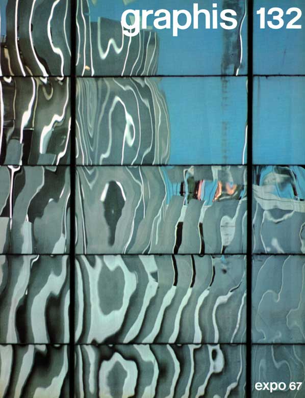 In 1967, Graphis, a Swiss magazine dedicated to graphic and applied art, dedicated the entire issue #132 to the 1967 World Exhibition in Montreal.
Hailing Expo as "a unique art form", the special issue sought to draw attention to the "significant artistic accomplishments produced by the occasion" from a design viewpoint. Subjects included Environmental Aspects of Expo 67, Official Graphics at Expo 67, design reviews of pavilions and exhibits (including Quebec, U.S. and Czechoslovakia) as well as a feature on La Ronde.
The result is an exquisite document about Expo's most successful designs, and the small graphic details so often overlooked by the general public...
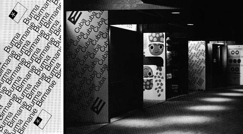
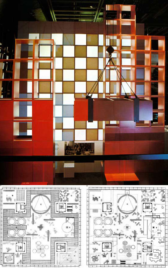 A shot of the interior (top) and floorplans (bottom) of the Quebec pavilion.
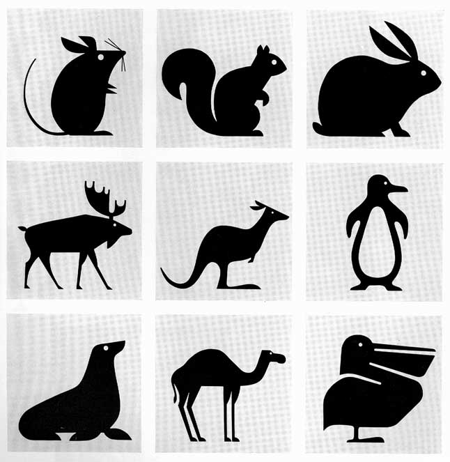 Animal pictograms designed for the Victoria parking lot.
 Colorful panels adorned Expo's many snack bars and refreshment concessions.
images: personal collection
Friday, December 7, 2007
Braniff International Airways
 Stewardesses pose in a mod mauve interior, 1965.
Braniff International Airways was founded in 1928 by brothers Thomas E. Braniff and Paul Revere Braniff.
In 1964, the poorly-managed airline was bought over by insurance tycoon Troy Post. Under the direction of advertising executive Mary Wells of Jack Tinker Associates, a massive overhaul of the Braniff image was launched in 1965: a campaign known as "The End of the Plain Plane". New Mexico architect Alexander Girard and Italian fashion designer Emilio Pucci were among those recruited for this project.
First on the agenda was to overhaul Braniff's public image, which included changing the staid red, white, and blue color scheme to a wide palette of bright hues. A new jelly bean fleet consisted of bold colors such as ochre, orange, turquoise, baby blue, lemon yellow and lavender; with white wings and tails. (Interesting to note is that lavender was dropped after one month as it is considered bad luck in Mexico.)
Wild colors were also applied to aircraft interiors, gate lounges, ticket offices, and even the corporate headquarters. Art to complement the color schemes was flown in from Mexico, Latin America, and South America.
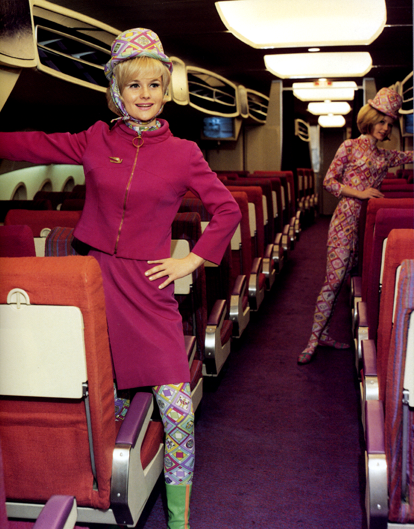
For the crew's uniforms, Emilio Pucci used nautical themes, while the stewardesses were outfitted in "space age" themes. The latter included clear plastic bubble helmets (to protect coiffures) and uniforms with interchangeable parts that could be removed and added as needed.
Today, the vintage Pucci attire designed for Braniff is highly valuable...
 747 Braniff Place on her home turf... Dallas, Texas.
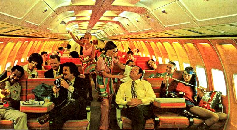 Stewardesses in Pucci's 1969 uniforms, in a groovy orange interior.
 Fort Worth room at Dallas Love Field, 1968.
 This meal is actually an example of the coach class! How times have changed!
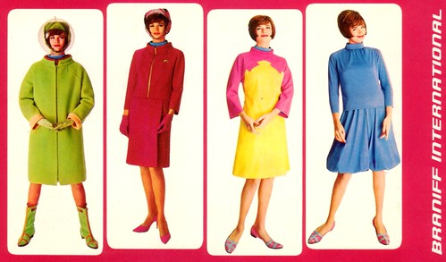 Emilio Pucci's space age designs for Braniff stewardesses, 1965.
images: (1) worldofkane.blogspot.com
(2) braniffpages.com
(3) oobject.com
(4) unknown source
(5) braniffpages.com
(6) unknown source
Monday, December 3, 2007
The Christian Pavilion
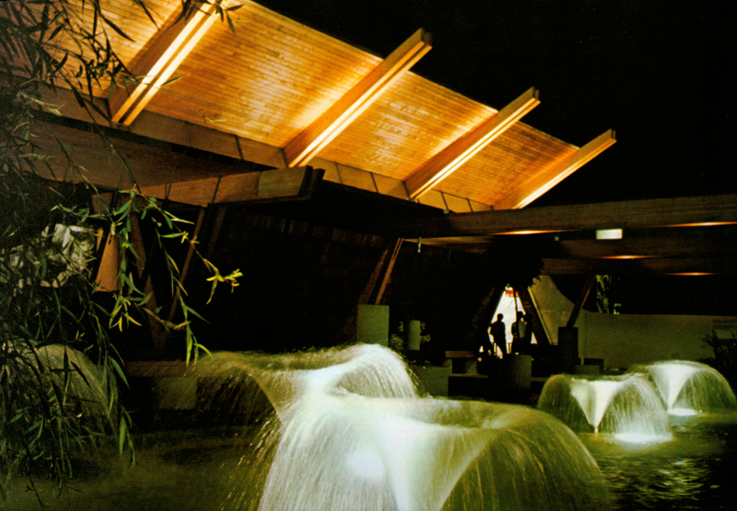
 The Christian Pavilion at Expo 67 was of a modern structure of wood and glass. Massive roof beams shaped like curved check marks plunged to almost ground level, then soared up beside the St. Lawrence River. A garden patio featured cedar trees, a gift from Lebanon, as well as modest concrete stools and where visitors could bathe feet in cooling fountains.
Situated on Île Notre Dame, the pavilion was symbolically placed between those of biblical countries Israel and Greece, and the United Nations pavilion. 8 churches worked to present a joint message in a spirit of cooperation.
The pavilion's theme was the Eighth Day, where man was free to create what he wanted on Earth. This Christian view of responsibility and reality was illustrated in a pavilion that had no stained glass, no religious art, no organ music.
 The first section of the pavilion sought to show "the world as it is", the so-called normal aspects of life. A series of cubes featured over 300 photographs of this everyday life. One of them was mirrored to show the visitor his or her own reflection and to underline the fact that everyone is "part of the picture". Photographs of densely crowded streets papered the walls, to a soundtrack of mixed crowd noises and the occasional scream. An insistent rhythm, which was actually the sound of a human heartbeat many times amplified, seemed to swell louder and louder, intensifying the atmosphere.
A staircase led the visitor down to the second section, into the pit of human experience. A shocking series of nightmarish images was presented with themes such as drugs, alcohol, violence, disease, etc... A controversial film entitled The Eighth Day? (the theme of the pavilion with a question mark) was part of this section. The film's designer worked for months sifting through newsreel footage, to assemble this 13-minute horror story of war, atrocity, murder and desolation.
From the cramped hell, the visitor then climbed into the spacious final hall, dominated by giant photographs and a series of 5 biblical quotations. This final section sought to show that life could have relevance, meaning, hope. There were seats where the visitor could rest and consider the implications of what he or she saw in the previous sections.
Perhaps this final section was a little too low-key, as some visitors were baffled, calling the pavilion's experience everything from blasphemous to outrageously poor in taste...
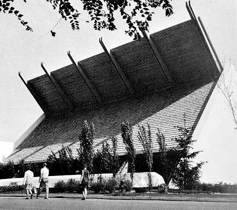 images: (top) courtesy DC Hillier
 (center) personal collection
(bottom) westland.net/expo67
Subscribe to:
Posts (Atom)