Showing posts with label groovy graphic art. Show all posts

Sunday, March 18, 2012

Klaus Bürgle

Klaus Bürgle
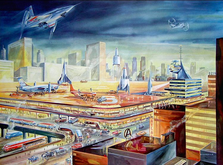
100-storey residential towers, jet powered commuter trains, 1968.

The graphic artist Klaus Bürgle was born in Stuttgart, Germany in 1926.

Bürgle studied at the the Stuttgart State Academy of Art and Design from 1948 to 1951. After a 1-year stint working at a graphic design firm, he decided to go freelance. It was in 1953 that he began illustrating for science and technology magazines such as Das Neue Universum ("The New Universe").

Throughout the 1950's and 60's, Klauss Bürgle created countless covers and interior illustrations for a wide variety of popular science books and magazines, as well as working on scientific-themed television shows. While space exploration was certainly his favorite subject, many of his works show futuristic cities and transport.

Much like Star Trek or Expo 67 itself, I've always loved how the "future" was depicted in the past...!

Klaus Bürgle
"Air station" connected to rail system with parking for thousands of cars, 1955.

Klaus Bürgle
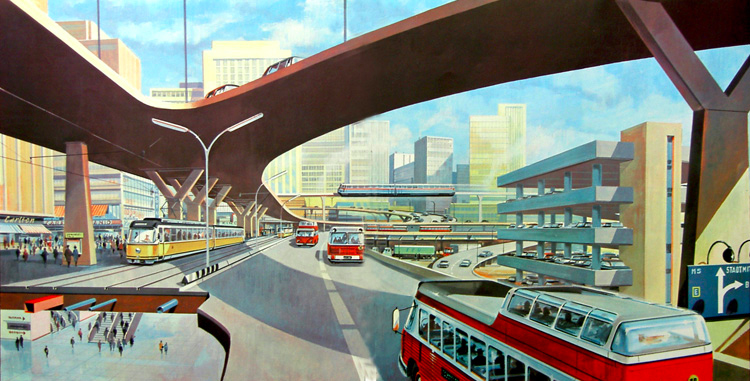
Interchange with seperate levels for cars and public transit, 1965.

Klaus Bürgle
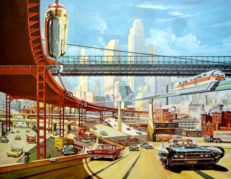
Multi-storey expressway with overhead monorails, 1959. (I love the cars...!)

Klaus Bürgle
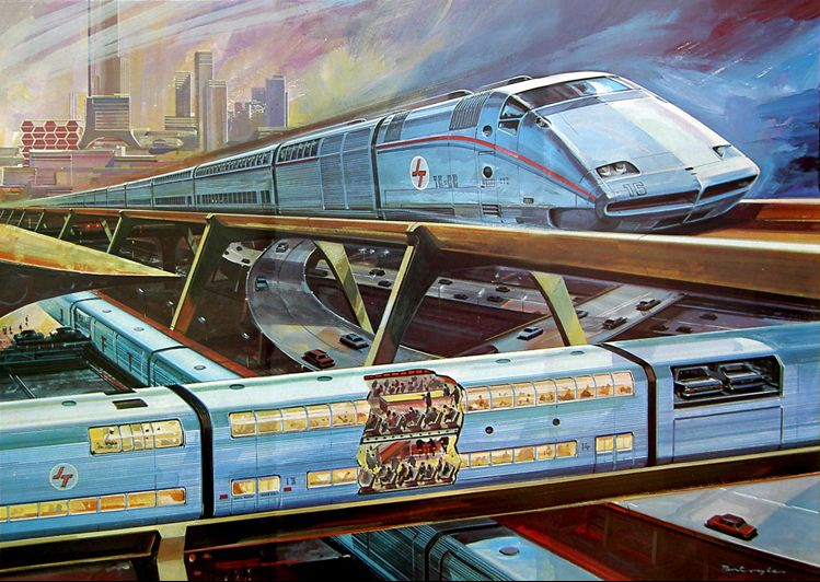
A fully automated rapid transit system carrying both people and cars, 1969.

Klaus Bürgle
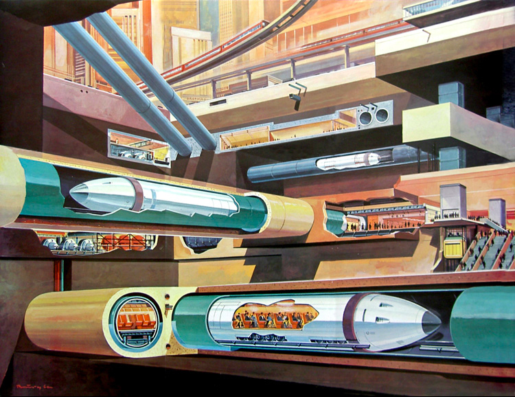
Remote-controlled high-speed tube trains, above and below ground, 1967.

Klaus Bürgle
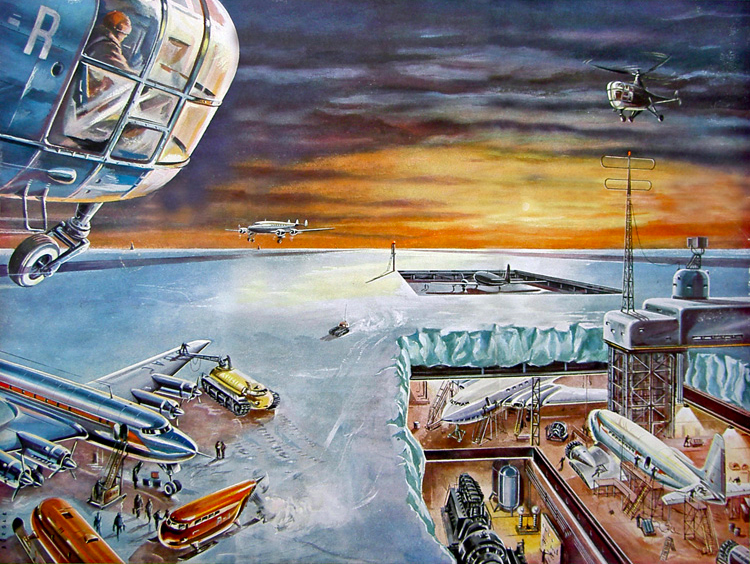
Polar-region air terminal, 1953.

images: retro-futurismus.de

Sunday, November 8, 2009

Saturday, August 22, 2009

Julien Hébert and the Expo 67 Symbol


Julien Hébert was born in 1917 in the municipality of Rigaud. A pioneer of modern industrial design in Québec, Hébert was originally a student of philosophy before venturing into the Arts. He studied sculpture in Montreal at l'École des beaux-arts, and in Paris under famed sculptor Ossip Zadkine.

Hébert's prominent career saw him teach art history and sculpture at the École des beaux-arts and planning and design at the École du meuble. He also played a key role in establishing the École du design industriel at the Université de Montréal, where he taught as well.

In 1979, he was awarded the distinguished Prix Paul-Émile-Borduas.

Julien Hébert's most famous contribution to popular culture is arguably the design of the Expo 67 logo. In the above Radio-Canada archive, Hébert himself sheds light on the Expo planners' selection process, as well as the meaning of the now-ubiquitous symbol.

image montage by author

Monday, January 19, 2009

TV Dinner Packaging


Here's a groovy little montage of some vintage Swanson product packaging from the golden age of TV Dinners... As a kid, I used to always eat the "Chicken and Whipped Potatoes Entrée" (at 0:28, in the video).

I love the international flare (TV Dinner style) of the "English Style Fish and Chips Entrée" (at 0:16); and the "German Style Dinner" (at 0:46), which included "Sliced Beef with Sauerbraten Gravy", "German Style Whipped Potatoes", "Bavarian Red Cabbage", and "Applesauce Cake" for dessert...

Guten appetit!


Small, medium, large: 3 convenient formats of fried chicken TV Dinners.

Thursday, August 14, 2008

Space-Age Polska Stamps

A little retro eye-candy: I'm loving these space-age stamps from Poland!

image source: stevey.com

Saturday, July 12, 2008

Tycho

I am so into Tycho lately... for both the ultra retro graphics and super smooth sounds!

Vaguely reminiscent of early Air, Tycho is the music project of San Francisco based artist and producer Scott Hansen.

From the website:

"As Tycho, Hansen blends swirling melodies into vaguely triumphant arcs that crisscross between stuttering beats and vocal samples, creating rolling sonic landscapes that extend off into the horizon...

Known in the design world as ISO50, Hansen's bucolic, sun-drenched design style serves as a backdrop for the music which so closely echoes his visual sentiments."

The images shown here are all prints available in the Tycho/ISO50 store.


images: merchline.com/iso50

Sunday, February 17, 2008

1976 Olympics Posters

Montreal hosted the 1976 Olympics from July 17 to August 1 of that year.

A series of posters was created for the '76 Summer Games and to promote physical fitness in general. My good friend DC Hillier came across the images in a flickr set: the posters are apparently still up somewhere at the Olympic Stadium.

DC painstakingly recreated the fab images you see here...


images: courtesy of DC Hillier

Thursday, January 24, 2008

The CBC Gem Logo

The "C" stands for Canada, while the radiating parts symbolize broadcasting.

Of all the CBC logos throughout the years, my favorite is the Gem logo.

Designed for the CBC by legendary graphic artist Burton Kramer in 1974, the iconic Gem is the most widely recognized logo of the corporation, and arguably the most recognized symbol in Canada...

It instantly brings me back to childhood mornings watching Mr. Dressup...

I want a car like this! CBC identity vehicle fleet, 1975.

A gorgeous billboard from the CBC visual identity program, 1975.

A storyboard for the animated station identification.

Proof of the Gem's lasting appeal: current merchandise from cbcshop.ca.


images: (1) author's own

(2-3-4) ccca.ca
(5) cbcshop.ca

Saturday, December 15, 2007

Graphis Magazine's Special Expo 67 Issue

In 1967, Graphis, a Swiss magazine dedicated to graphic and applied art, dedicated the entire issue #132 to the 1967 World Exhibition in Montreal.

Hailing Expo as "a unique art form", the special issue sought to draw attention to the "significant artistic accomplishments produced by the occasion" from a design viewpoint. Subjects included Environmental Aspects of Expo 67, Official Graphics at Expo 67, design reviews of pavilions and exhibits (including Quebec, U.S. and Czechoslovakia) as well as a feature on La Ronde.

The result is an exquisite document about Expo's most successful designs, and the small graphic details so often overlooked by the general public...

Panels used to identify shops of various nations.

A shot of the interior (top) and floorplans (bottom) of the Quebec pavilion.

Animal pictograms designed for the Victoria parking lot.

Colorful panels adorned Expo's many snack bars and refreshment concessions.

images: personal collection

Sunday, May 20, 2007

Jenn Ski

Jennifer Skoropowski had been working as a freelance graphic designer. Frustrated by the fact that the kind of design work she enjoyed (the really creative and cutting-edge stuff) was hard to come by, she decided to stop freelancing, and began focusing on her art.

In early 2007 she launched Jenn Ski (a pseudonym based on her high school nickname). She is currently making wall art: paintings (acrylic and paper on hardboard) and poster prints. Jenn plans to expand her art to include pottery, pillows, stationary, etc.

The mix of organic pod shapes with a retro touch totally appeals to me!

Visit her website at jennski.com