 I have always had an interest in logos and corporate identities. I remember helping my dad create a logo for his company when I was in grade school.
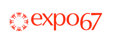
Designed by Montreal industrial artist Julien Hébert, the Expo 67 logo is a timeless design with it's avant-garde lower-case font (Optima) and it's circle of stick-figure men, arms outstretched in fellowship. Instantly recognizable, infinitely elegant, the graphic symbol of the 1967 World Exhibition is as close to perfection as a logo could be...
But, as you know by now, I have a biased opinion when it comes to Expo 67!
image: wikipedia.org
No comments:
Post a Comment